Boa Mistura bring poetry and magic to São Paulo
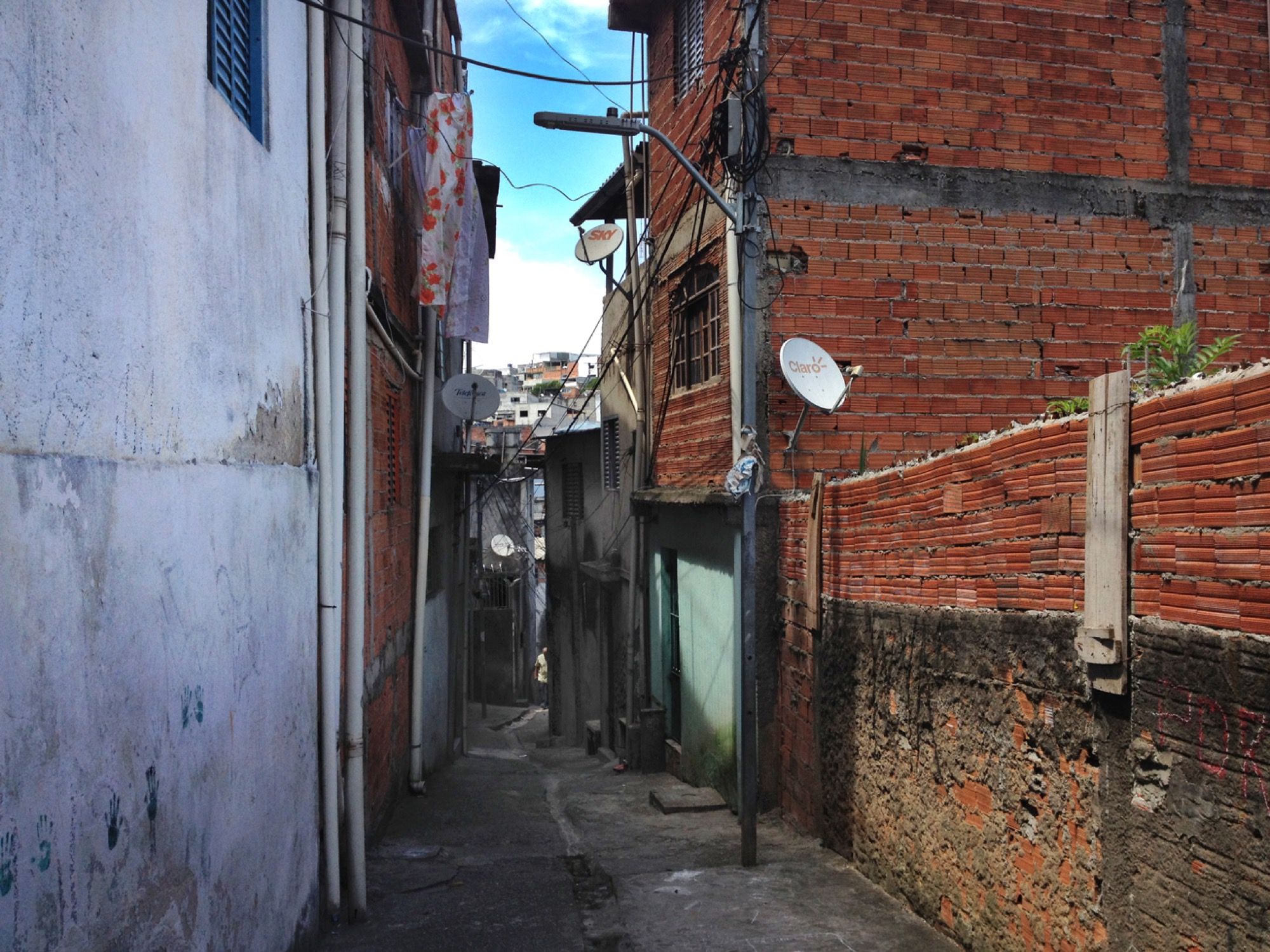
Earlier this year the art collective Boa Mistura returned to the favela of Vila Brasilândia to continue working on their project “Lus Nas Vielas”.
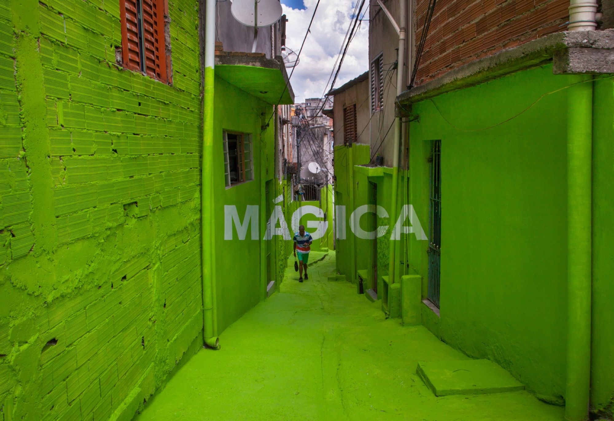
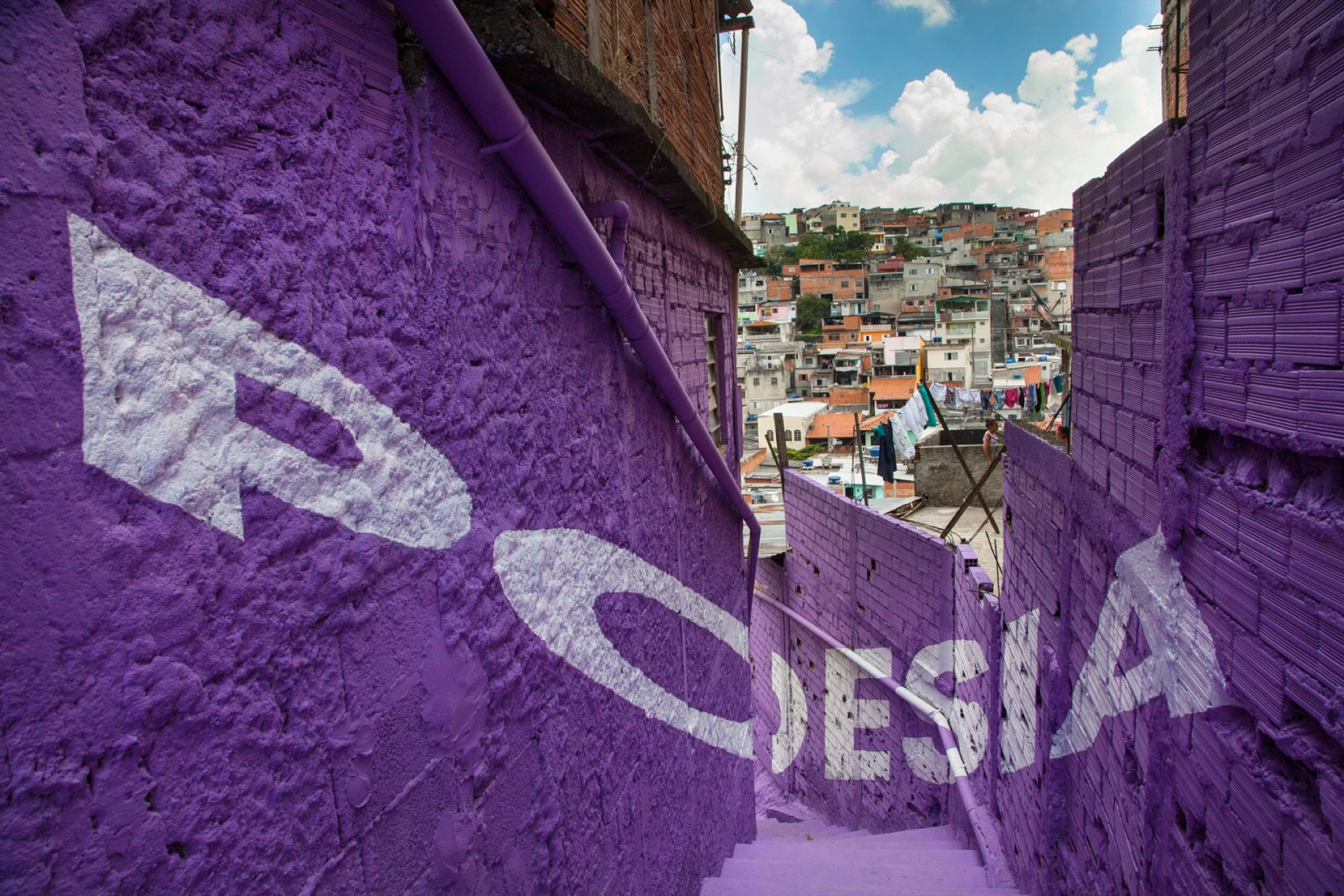
In 2012 they painted a series of words in anamorphosis on the walls of the São Paolo favela. The concept was to display the values of the people in the neighbourhood on a big urban canvas. The artists achieved this by combining big white letters with bright colours on the walls and floors. They wrote: “amor, orgulho, doçura, firmeza, beleza” (love, pride, sweetness, strength, beauty).
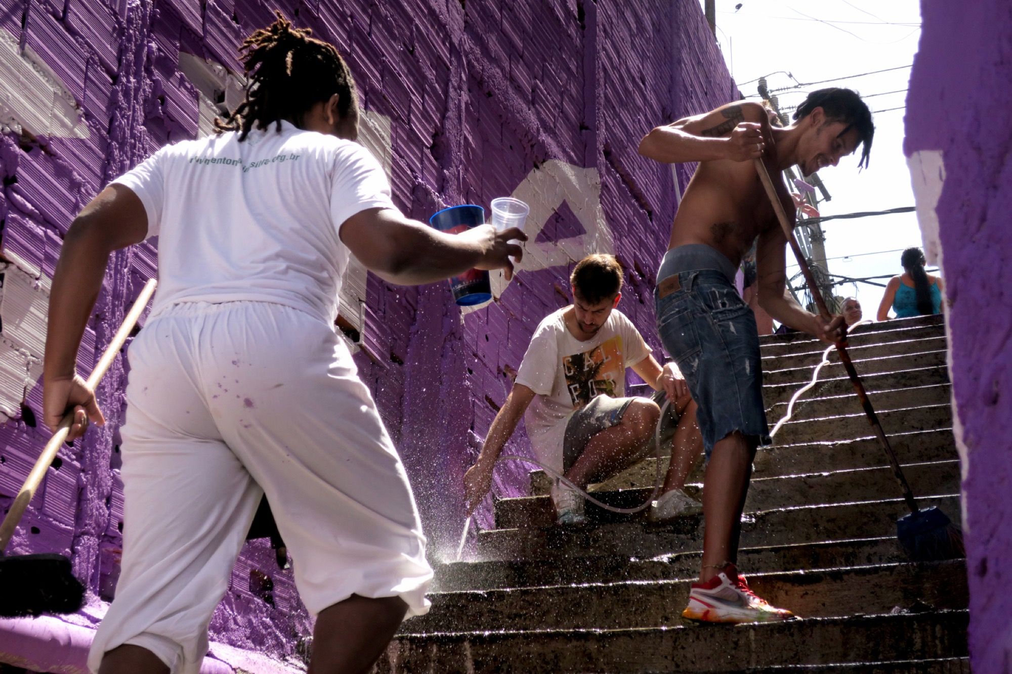
The whole process was a collaboration that extended beyond the walls to create new relationships between people and make them smile.
Five years later they added 2 new words: “poesia” and “mágica” (poetry and magic). It goes to show that with a few buckets of paint you can turn dull walls and irregular buildings into true works of art which people can feel proud of. Another welcome side effect is the attention this project has brought to an otherwise neglected part of the city.
The artists explain:
“We as urban artists have to reverse that process of negativity, because the favela does not have to be synonym with violence, because life in this place is more intense and real, because there is no purest and most sincere poetry, than the one that comes from the favelas.”
Find out more about the collective and their projects on their website.