Spotify’s new discovery channel

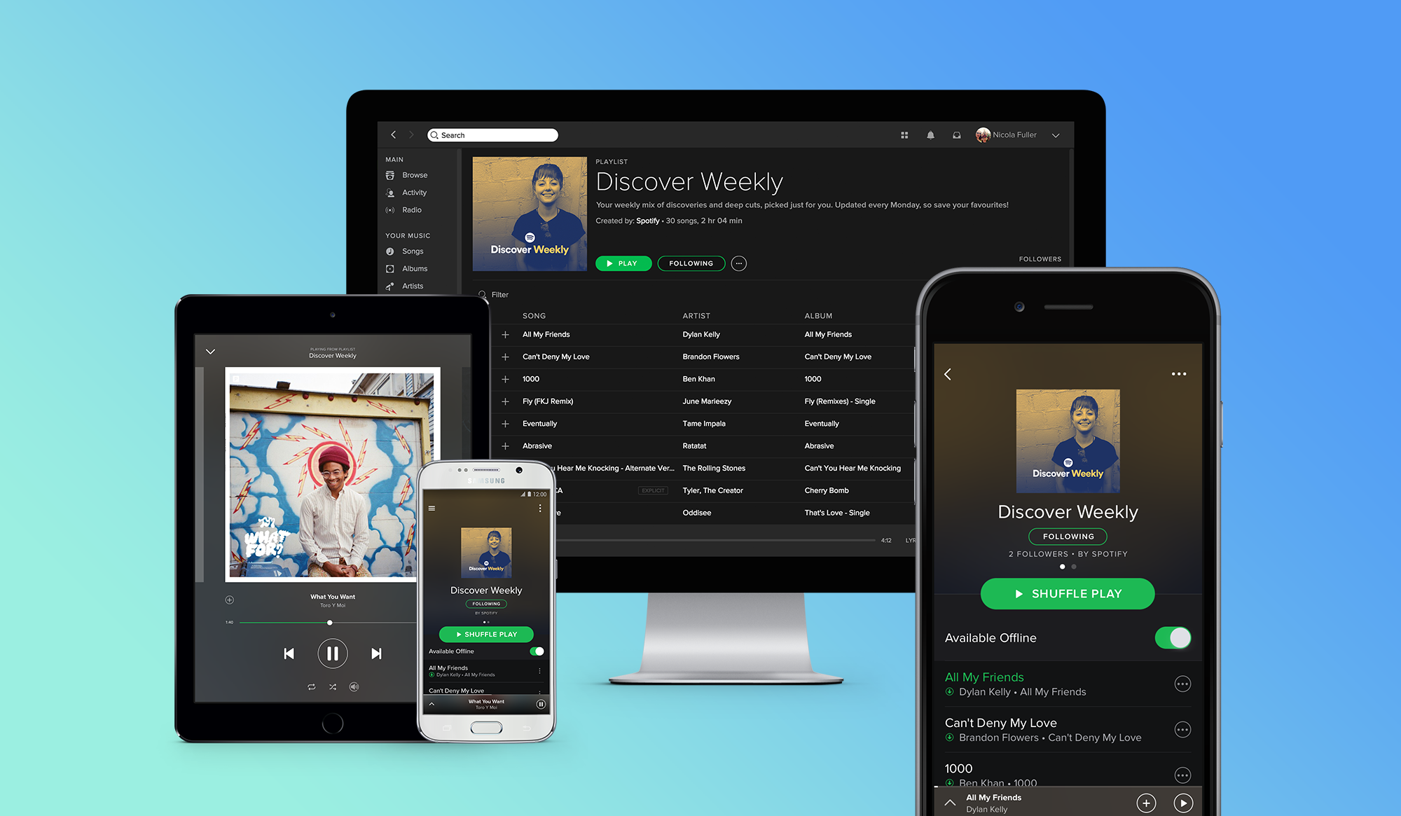
I’m an avid Spotify listener and even the recent release of Apple Music couldn’t sway me away. The team behind Spotify just keeps improving the product (and the brand) with well designed and relevant features. Songs matching your tempo while running or previewing songs on long tap are just some of my favourites from the past. Enter Discover Weekly” which is essentially an entirely personalised playlist based on your own listening and on other user’s playlists with similar tastes. Apparently it’s supposed to become smarter over time and the more you listen, the better it gets.

One of the main reasons I started using music streaming services in the first place was for exactly that - music discovery. I really liked Rdio’s approach which Spotify kind of adopted but this new playlist is just brilliant and gives me something to look forward to every Monday.

It’s available across all platforms and behaves like any other playlist, except it resets every week so make sure to save the songs you like!

Is Adobe improving the wrong software?

Yesterday I updated to Adobe CC 2015 and couldn’t wait to try out the much anticipated new features in Photoshop. This is coming from someone who uses Illustrator almost exclusively these days by the way. Without further ado, let’s have a look at what I thought were the most interesting ones.

Design Space

Design Space looks like it’s the slimmed down version of Photoshop, that screen designers in particular have been waiting for. You can toggle between the regular view and the new mode quite easily which is neat. In order to have access to this new space, you have to switch it on in the preferences panel as this is still considered a technology preview feature”.
Since a video tells more than a thousand words, I encourage you to check out this screencast commented by Photoshop Senior Product Manager Zorana Gee:

Artboards

You’ve seen them in Illustrator and you might have seen them in Sketch. Now they’re finally available in Photoshop. What I like about their implementation is that the Artboard panel is similar to Sketch which is what I’m used to. Besides that, nothing much to see here so move along.

Stacked layer styles

Similar to Illustrator’s Graphic Styles panel, Photoshop now allows you to have as many as 10 instances of gradient overlay, colour overlay, drop shadow, inner shadow and stroke. You can add these either to a single layer or a layer group and edit them at any time. I’m surprised there is a cap, but it makes sense from a performance perspective.

Export as

This option is replacing the well-known Save for Web which is labeled legacy and should disappear fairly soon. I used plug-ins like PNG Express or Slicy for exporting PNGs in the past, but this should do just fine when it comes to automated exporting, without having to rely on third party software. Be warned that it doesn’t allow to export slices anymore if you’re into that kind of thing.

Glyph panel

Some may not even care about this addition at all, but if you appreciate typography you will love the glyph panel which allows you to browse all available glyphs in a font, view alternatives and basically have fun with OpenType features. InDesign has it, Illustrator has it and Photoshop was long overdue.

Why Photoshop though?

I’d argue that Adobe has been focusing their attention on the wrong software for the past couple of years. Killing off Fireworks a while back infuriated many web designers, many of which have since moved on to the competition. Now turning Photoshop into something it wasn’t meant to be in the first place is a huge undertaking. At least it shows that the company has been actively listening to the community, even if all the new Sketch evangelists this might come as too little too late. However I’m very surprised that product isn’t getting more attention from Adobe. Seriously.
What about Illustrator? A few improvements could really push it over the top and make us forget about Photoshop entirely. It’s arguably the best software (next to Sketch) to address mobile and responsive web design that we have right now.

Consider this:

  • Artboards have been around since 2009
  • It has Layers just like Photoshop
  • It has Graphic Styles
  • It has Symbols
  • It is vector-based

Khoi Vinh recently conducted an unofficial survey among design teams in New York City on the State of Design Tools. It turns out that while Photoshop is still widely used, Illustrator is not far behind.

Adobe Illustrator is surprisingly popular. It used to be rare, at least in my experience, to find digital designers who used Illustrator, but in one of the bigger surprise findings from our visits, we encountered a sizeable contingent of folks for whom Illustrator is their tool of choice. This seems to be a function of the popularity of responsive design, for which Illustrator’s support for multiple artboards is well suited, and Retina screens, for which Illustrator’s vector-based tools are a natural fit.

This 2015 update is certainly a step in the right direction and should keep many designers satisfied for some time. As far as I’m concerned, Illustrator will remain my go-to design software until something better comes along. There’s always next year, right?

The future of touch screens is in good hands

I stumbled upon this video about the possible future of touch screens by Chris Harrison from CMU and found it amazing. You can see him demonstrating their TouchTools and TapSense apps for tablets.

The device they put together is able to achieve something really cool: anticipating what a user wants to do next. By positioning their hand as if they were actually holding a physical object over the glass users get access to that same object except on screen. In fact, the smart screen recognises the grip unique to a product and its intended use.

While some of the examples shown may provide little real-world use, such as a camera or a mouse, this little experiment makes you think about all the possibilities associated with this type of technology.

What I find even more impressive though, is the precise recognition of different types of touch input such as fingertip or knuckle by the device. This opens up a lot of possibilities in terms of interface interactions, as a single button could output various results depending the nature of the touch and essentially triple the amount of possible actions on a given screen.
I can’t think of a current app that would directly benefit from this, except for something like Knock maybe. And even then it’s a long shot.
Nevertheless, it’s going to be really interesting to explore new ways to interact with screens in the future.

Benefits of prototyping

As you may have noticed, these days it’s not enough anymore if you only provide static mockups as a designer. People have come to expect more and rightfully so. Those people being a mix of developers, clients or stakeholders you end up working with at some point or another of a project.

With the emergence of new tools created specifically for interactive prototyping, another layer of complexity has been added to a designer’s job. Last year alone, a handful of these were released trying to overtake Facebook’s Origami/Quartz Composer reign. But with this new layer also comes a great opportunity to design and communicate more efficiently.
In this post I’ll lay out the benefits of including prototypes into your workflow.

Why should you prototype?

Just because you haven’t felt the need to build prototypes in the past that doesn’t mean it can’t improve the way you design right now. As with many things in life, it’s never too late to get started. Lucky you!
Anyways, my short answer to this broad question would be something along the lines of: Because it’s not only useful but really fun!”
For the longer answer you can keep on reading.

Test early, test often

The main reason for me to jump into prototypes in the early stages of a project is to try out interactions and see if they make sense from a user perspective. Testing your app concept thoroughly in the early stages is invaluable. It allows you to discover possible shortcomings or issues you haven’t even thought of before.
As strange as it may sound, the more mistakes you make at this point, the better. Your prototype is nothing more than a disposable sketch anyway.

Iterate, iterate, iterate

Building on the previous step, identifying a problem allows you to revise your design decisions in order to find something that might be more suitable for the issue at hand. After all it’s just another canvas for you to play on. Again, your prototype is nothing more than a digital sketchbook and you should treat it that way. It’s in your best interest explore several options before going ahead with the final design. Who knows what great solution you may end up with after some tinkering?

I’ve found myself literally just playing around with different ideas on the fly, just because ideas could be discarded guilt-free and that felt pretty good. In fact, this is where I encourage you to go over the top with your designs because once the project goes into production, nobody will want you to try out an alternative way to implement that navigation drawer. Trust me.

Communicate with your team

Whenever a developer asks “What happens if you tap here?” pointing at your wireframes, you can simply pull out your prototype and walk him through the interactions of the app. This saves everyone time and your developer will be able to understand exactly what you mean. No more guessing or misunderstandings because initial instructions were too vague. No confusion = good.

Lastly, keep in mind that a prototype can and should generate spontaneous feedback from your team. Since it’s not the finished product, I’ve found that people are more inclined to critique a prototype as only little time was spent creating it in the first place.

Hopefully this made you want to get started with your own interactive prototypes. In another post I’ll write about the current tools we have at our disposal and why I prefer one over the others.

Random Link Bundle

Dropping these here because I found them quite cool and you might, too!