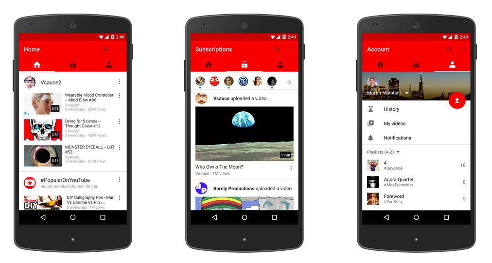
Android is shying away from the side navigation

In a recent update to the Android app, YouTube has introduced a new main navigation: tabs!
The standard side navigation is gone. Yes, it’s that hamburger icon which is common for Android apps and adheres to the Material Design guidelines by the way. To me this is a welcome change considering tabs drastically outperform a side drawer when it comes to global navigation as Luke Wroblewski points out. It’s hard to deny that the previous iteration was bloated and difficult to use efficiently, especially if you were a power user.
Although Android apps frequently make use of tabs, they would be relegated to a secondary navigation. This is in contrast to its major competitor iOS, which has claimed tabs as primary navigation since its launch.
Is this move an exception in the Android universe, carefully guided by analytics or are we witnessing signs of regret in regards to a primary side navigation which may not be as obvious on first glance?
Only time will tell. In the meantime I’ll have to get used to how weird those tabs look on the iOS version of YouTube.