Posts tagged with: design

Roguelikes and the UX design process

I’ve been into video games for as long as I can remember but it wasn’t until my mid-twenties that I discovered an entirely new genre called roguelikes. The name comes from the original dungeon crawler Rogue released in 1980.

Two of the major defining characteristics of this genre are permanent death and randomly generated levels. As you can guess the games are usually very difficult and frustrating, especially since there is no saving or reloading. Ever. Once you die, you lose all of your past progress and start again from scratch.

Over the years many games tried to replicate the formula that made Rogue great. The rise of roguelikes eventually led a group of passionate people to create a scoring system to determine how roguelike” any given game is. This interpretation of the genre became known as the Berlin Interpretation which highlights 9 high value factors” of a true roguelike game:

  1. Random environment generation: the world is randomly generated so that every playthrough is different.
  2. Permadeath: when your character dies you lose all progress and have to restart a new game.
  3. Turn-based: each command corresponds to a single action without having to worry about time.
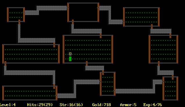
  4. Grid-based: the world is represented on a grid so that monsters and players take up the same amount of space.
  5. Non-modal: every action should be available at any point of the game.
  6. Complexity: the game is complex enough to allow several solutions to common goals.
  7. Resource management: you have to carefully manage your limited resources like keeping track of health or thirst.
  8. Hack’n’slash: the player should be able to fight and destroy most things in the game.
  9. Exploration and discovery: the game requires exploration of the dungeon levels and the discovery of unidentified items for every new playthrough.

Why does any of this matter? Well I just picked up my latest roguelike: Hades by Supergiant Games and it got me thinking.

Even though I’ve played many roguelikes before, it’s only during a session of Hades that something occurred to me–advancing in a roguelike game is very similar to the UX design process.

Discovery

Roguelike

Procedurally generated levels ensure the obstacles and the path to completion remains unknown. Rooms and game elements remain the same but the way they’re laid out differs from one run” to the next.

Design

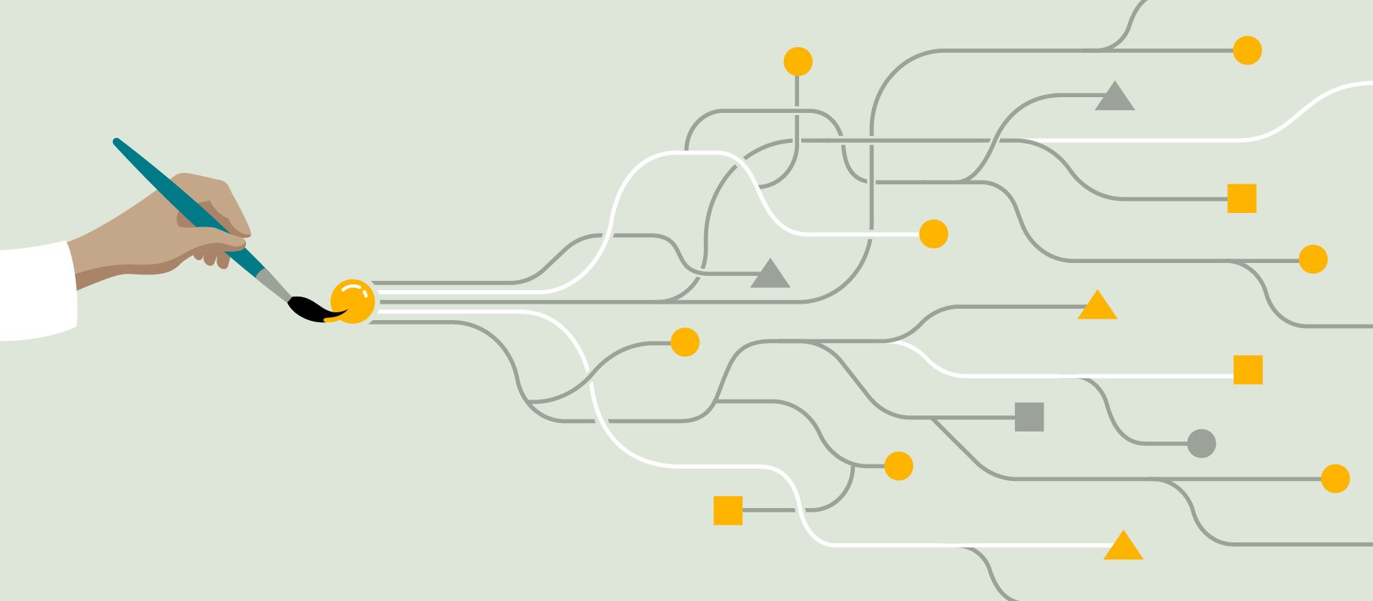
At the start of any project the design solution usually isn’t known. Sometimes even the problem isn’t clearly defined either. The designer has to embark on quest to find the truth while dealing with ambiguity along the way. The deeper they get into the research, the more findings they uncover. Their ideas generate new ones as they move from one concept (“room”) to the next. Since the design process is inherently messy and far from linear, there’s no telling where they might end up with a solution.

Failing forward

Roguelike

The beauty of roguelikes is that they’re unforgiving. One tiny mistake and your hero dies a horrible death while you watch in disbelief. A death is never in vain, however, because with each failure comes a valuable lesson. Maybe you encountered a new monster or trap that you haven’t seen before which led to your sudden demise. Whatever the case may be, you will have learned something. About the environment, the enemies or maybe your character’s abilities. Those insights will allow you to make it further during your next attempt, with each run becoming a lesson in itself.

Design

Fortunately when a designer’s ideas don’t pan out straight away they don’t die. That would be quite cruel, wouldn’t it? They might, however, have to kill” their ideas early and often without ever getting too attached to a single one too soon. A lot of times they’re encouraged to fail fast in order to focus on the next idea with possibly more potential.

As with every death in a roguelike game, every failed concept in design leads to valuable learnings and ultimately a better solution. It’s important to take time to reflect: Why did this idea not work? What can they learn from the current prototype? How could it be better?

Power-ups and retention

Roguelike

Modern games of the genre implemented achievements and unlockable items that carry over from one run to another. This means that even though a run might fail as it’s often the case, the player still retains a sense of progression through items or power-ups that will help them in future playthroughs. They might start with more life or better weapons for example.

Design

With each customer or stakeholder interview, each prototype and each usability testing session the designer will inevitably learn more about the problem at hand. These insights don’t vanish–they remain with them and inform their decisions for the next steps. These valuable bits of information are their little power-ups for the next phase testing. They’ll pave the way for a more powerful” prototype that will be able solve more problems than the previous one.

Final thoughts

I’ve found that once you start accepting that failure is inherently part of the learning process you’re much further along than other designers.

Subform is probably the last Kickstarter I backed

subform

In 2016 I found out about a new digital design tool called Subform on Kickstarter. At that point I’d already been fully commited to Sketch but I was intrigued by this approach around dynamic layouts and what seemed like incredible flexibility.

I waited until pretty much the last day to actually back this project because I’d been disappointed by previous Kickstarter projects in the past. (Haven’t we all?)
For some reason though I was cautiously optimistic with this one. In the final hours the creators Ryan Lucas and Kevin Lynagh managed to surpass their initial goal of $100,000. When it was all said and done they were sitting on $112,651.

Shortly after the end of the campaign I received an email with access to the beta software as well as the forum exclusive to backers of the project. I honestly had very low expectations but still had a quick play with this first version of Subform to see what it’s about.
However I didn’t bother investing a lot of time in it until more progress was made. It seemed overly complicated compared to something like Sketch or Adobe XD which didn’t appeal to me initially so I left it at that.

subform_screenshot

Over the next few months I would get weekly updates of trending forum posts and while I didn’t particpate in the discussions at all it still gave me a sense of progress. The developers were interacting with the community and I would check the app for updates every now and then.
Things seemed to be on track and I was expecting a major release in the near future. Then something weird happened.

The weekly updates had less content. Backers seemed to have deserted the forums or lost interest. I decided to look into Subform’s status when a backer voiced his concerns about the development of the tool. A week later the creators made an announcement:

Hi friends,
We have some bad news: We will no longer be developing Subform.

[…]In testing and talking with a huge range of designers, we found that the promise of Subform was different for everyone. Many wanted a more efficient drawing tool, but only if it has full feature parity with Sketch. Some wanted complex conditional logic for prototyping, a la Axure. Others wanted a tool for visually composing React components, a WYSIWYG web editor, and so on.

Unfortunately, what we’ve found is that there isn’t a single product scope that’s achievable in the near-team—and is still useful and usable for the majority of testers. Going forward, we suspect that we’ll see more specialized tools for specialized tasks, rather than monoliths. (We released Sketch.systems37 as a standalone tool, rather than a complex integration into Subform, for this reason.)

We appreciate all of the support and feedback ya’ll have given us over the past three years, from funding our first prototype on Kickstarter to the many long conversations here on this forum that convinced us that we needed a better layout engine and friendlier UI interactions.[…]

So that was it. Boy am I glad I didn’t waste any time on this. I already learned my lesson with Macaw. Now don’t get me wrong, I’m still disappointed. Not because of the money but because they tried their best and couldn’t make it work which is always a shame.
What is a bit weird in all this though, is this thing called Sketch.systems. I think we can all agree that the name is a terrible choice. I’m not sure how to feel about it, especially since they released it before they stopped working on Subform and mentioned it in their final announcement like it was no big deal.

As a designer I think it’s an interesting concept. As a Kickstarter backer I get the impression that somewhere along the way they saw this shiny new thing which seemed more promising than Subform and decided to call it quits.

I’ve had my fair share of Kickstarter disappointments, which is probably another post by itself. But for now I’m staying away from these types of projects until they’ve made it to the commercial release phase. Design tools especially tend to vanish very quickly in this space lately. Whether it’s through acquisition or abandonment.

That might mean that in the future I’ll have to wait longer and probably pay more which is fine by me if the product is worth it.

In the meantime we’ve got Framer X to look forward to so things could be worse.

My impressions of Semi Permanent 2017

In their own words Semi Permanent is the Mecca for creatives, entrepreneurs and future thinkers.

It’s a two-day conference with diverse speakers that range from start-ups to some of the world’s top companies. In the past the topics would focus on creativity, art and design but in recent years there has been an increase in talks about business, strategy and technology.

The conference has been around for 14 years and has chapters all over the globe, so it’s pretty cool to have it come to Auckland every year.

Usually when I describe it to people, I affectionately like to call it a poor man’s Webstock. This has much more to do with the affordable price tag than the quality of speakers though. Semi Permanent offers much better value for money in that regard.

Below I picked some of my favourite speakers and my key takeaways for each.

Lucy McRae

Lucy is a science-fiction artist, Body Architect and creator of the Swallowable Perfume. She’s responsible for a variety of projects that explore how the human body will evolve in the future.

She started off her talk by mentioning that she recently wrote her own funeral speech which gave her a unique perspective on life and how she wanted to be remembered.

Lucy also advised not to let labels define you. That’s essentially how she got her job at Phillips by the way. The recruiter asked her what she did and initially she couldn’t really answer that question as she wasn’t a designer, developer, product manager or similar. She spent a week thinking about it and came back convincingly as a Body Architect–she was hired on the spot.

Through her projects, such as Future Day Spa or Make Your Maker she showed that art can help overcome someone’s personal limitations. She believes that what it means to be human will be redefined in the future.

My favourite quotes:

Design from a place of doubt.”

Push your body.”

Move out of your habits.”

Are we doing what we want right now?”

Learn more about Lucy McRae.

Erik Klimczak

Erik is the Creative Director of Advanced Technologies and Data Design at Uber. He shared insights about the design process at Uber and emphasised the importance of truly getting to know your users by conducting field research on a global scale. Their design teams interview people all around the world to identify their specific needs and problems.

For example I learned that in India, Uber offers a service called MotoX where drivers pick you up on a motorbike, which is the most popular (and most practical) vehicle in the country.

He also mentioned how Uber is constantly creating new opportunities for people. It enables women in Saudi Arabia to travel independently or helps poor households generate additional income to make ends meet.

His talk was very visual and a prime example of telling stories with data. If you’re into that sort of thing I highly recommend checking out deck.gl which is the framework the team uses to create interactive maps. Often they end up looking so good that Erik prints them out to make posters for the office.

There were also animations of Uber driving routes showing things like people getting dropped off randomly around their chosen destination because of inaccurate directions.

What really stood out to me though, was the huge amount of data Uber has at their disposal simply because of people using the app while driving. They can track pretty much everything as you can see in this video of a day in the life of Uber Los Angeles. Whether it’s road conditions, traffic jams, potholes or even the driver’s habits.

Yes, that’s right. Uber can even tell whether or not you’re an aggressive driver. In that regard, Erik noted that the human mind is unreliable as there is always a gap between what people say they do and what they actually do. I’ve found this to be especially true when conducting intercept interviews, where asking the right questions is key to get valuable answers from people.

Fortunately Uber uses and shares this data openly for the greater good. Cities can access the platform Uber Movement and improve their infrastructure based on accurate stats sourced from millions of cars on a daily basis.

Finally he talked about his experience in a self-driving Uber car which felt surreal. Their research showed that people need to be re-assured that the car knows what it’s doing so a screen was added in the back of every car so that passengers can see what the vehicle’s sensors are showing.

Also:

Ask better questions.”

Learn from data.”

The impact on a single person leads to an impact on a whole city.”

Learn more about Erik Klimczak

Instrument

This talk featured three directors of the design agency Instrument: Steve Denekas (Executive Creative Director), Kara Place (Executive Director) and John Brown (Technical Director).

To kick things off they showed us their recent reel which is simply amazing:

This talk was full of little gems and takeaways around the design process, team work, client relationships and innovation. I found Steve’s part the most interesting and relevant so that’s what I’m going to focus on.

Good ideas come from bad ideas.”

At Instrument they believe that ideas come from everywhere. Whether it’s the newly hired intern or someone from the accounting team. Everyone can contribute their ideas and thoughts regardless of job titles.
This really resonated with me as I’ve found that in the past some of the best ideas or solutions came from developers.

Find the truth and build it.”

When it comes to the design process, Steve advised to move quickly from talking to doing.” Instead of wasting time in random meetings, start producing something tangible that you can talk about in a meaningful way. I believe in doing just enough research to start iterating on a solution and getting feedback as early as possible.

Tell clients that you don’t know.”

The process has a beginning and an end, but it’s the middle that’s undetermined. Steve and the team are honest with clients when approaching a new problem.

In my experience the truth is that often we know the problem but we’ll have to diverge and iterate to come up with a solution. This part often makes people uncomfortable and they like to see a solution upfront which achieves little more than setting false expectations.

I loved that he embraces the unknown of the process and communicates it clearly to clients.

Finally, the team talked about their recent project with Google where the brief was to showcase power of the Google Cloud in innovative ways.

This led them to try out all sorts of weird experiments with those apps. For example they managed to do animations within Google Sheets and found out that it has a frame rate of 20FPS. (Something that even Google engineers didn’t know — why would they?)

Also:

Make complex things simple.”

Give people something to react to.”

Don’t use Lorem Ipsum.”

Love the problem.”

Sweat the details.”

Ask the right questions during discovery.”

Learn more about Instrument

Generating design elements from code with React Sketch.app

Airbnb’s design team released a new open source library for Sketch based on React. It allows to generate templates, components and assets directly from code instead of drawing them in Sketch. This eliminates the need to maintain their design language system across Sketch files for designers and Github repos for developers, so that everyone uses the exact same elements from a single source of truth. In the past we’ve seen many plugins try to generate code from Sketch files in order to bridge the gap between design and development, but the React Sketch.app is doing the opposite.

Once you dig a little deeper you start to see the many advantages of this new approach, especially for big international platforms like Airbnb. As their design system grows, new components can require changes that include colour, typography or spacing. Imagine having to redraw things like that in Sketch every single time to see if it’ll work across thousands of devices and hundreds of languages. You can use code to do the heavy lifting for you and generate content on many artboards with different sizes instead.
The library also makes designing with data really easy by allowing you to use traditional APIs and GraphQL endpoints. The same goes for internationalisation if you want to see how titles or button labels fit across your design system.

Even though I’m not too familiar with React I’m very excited to explore the possibilities that come with this open source library. It further reduces the gap between design and development in a radical way. Head over to airnbnb.design to read more about Painting with Code” where Jon Gold explains the framework in more detail.

Drawit, a drawable user interface

Drawit is a user interface exploration imagined by MIT Media Lab Research Assistant Marco Exposito. His bachelor’s thesis project takes visual programming to a whole new level.
In fact, it allows you to create your custom interface by drawing shapes on a tablet. These shapes are defined by the user and can be seemingly random. They then connect to physical objects like a lamp and allow you to change its properties remotely. In the example above, a big circle represents the lamp and a smaller darker circle acts as a button. Drawing a line between these two shapes essentially connects them with one another and make interactions possible. Linking multiple physical objects together is just as easy.
I really like how this approach makes no assumptions on the users background and can be whatever they want it to be. This method of user input appears to be the purest form of UI customisation.

Is Adobe improving the wrong software?

Yesterday I updated to Adobe CC 2015 and couldn’t wait to try out the much anticipated new features in Photoshop. This is coming from someone who uses Illustrator almost exclusively these days by the way. Without further ado, let’s have a look at what I thought were the most interesting ones.

Design Space

Design Space looks like it’s the slimmed down version of Photoshop, that screen designers in particular have been waiting for. You can toggle between the regular view and the new mode quite easily which is neat. In order to have access to this new space, you have to switch it on in the preferences panel as this is still considered a technology preview feature”.
Since a video tells more than a thousand words, I encourage you to check out this screencast commented by Photoshop Senior Product Manager Zorana Gee:

Artboards

You’ve seen them in Illustrator and you might have seen them in Sketch. Now they’re finally available in Photoshop. What I like about their implementation is that the Artboard panel is similar to Sketch which is what I’m used to. Besides that, nothing much to see here so move along.

Stacked layer styles

Similar to Illustrator’s Graphic Styles panel, Photoshop now allows you to have as many as 10 instances of gradient overlay, colour overlay, drop shadow, inner shadow and stroke. You can add these either to a single layer or a layer group and edit them at any time. I’m surprised there is a cap, but it makes sense from a performance perspective.

Export as

This option is replacing the well-known Save for Web which is labeled legacy and should disappear fairly soon. I used plug-ins like PNG Express or Slicy for exporting PNGs in the past, but this should do just fine when it comes to automated exporting, without having to rely on third party software. Be warned that it doesn’t allow to export slices anymore if you’re into that kind of thing.

Glyph panel

Some may not even care about this addition at all, but if you appreciate typography you will love the glyph panel which allows you to browse all available glyphs in a font, view alternatives and basically have fun with OpenType features. InDesign has it, Illustrator has it and Photoshop was long overdue.

Why Photoshop though?

I’d argue that Adobe has been focusing their attention on the wrong software for the past couple of years. Killing off Fireworks a while back infuriated many web designers, many of which have since moved on to the competition. Now turning Photoshop into something it wasn’t meant to be in the first place is a huge undertaking. At least it shows that the company has been actively listening to the community, even if all the new Sketch evangelists this might come as too little too late. However I’m very surprised that product isn’t getting more attention from Adobe. Seriously.
What about Illustrator? A few improvements could really push it over the top and make us forget about Photoshop entirely. It’s arguably the best software (next to Sketch) to address mobile and responsive web design that we have right now.

Consider this:

  • Artboards have been around since 2009
  • It has Layers just like Photoshop
  • It has Graphic Styles
  • It has Symbols
  • It is vector-based

Khoi Vinh recently conducted an unofficial survey among design teams in New York City on the State of Design Tools. It turns out that while Photoshop is still widely used, Illustrator is not far behind.

Adobe Illustrator is surprisingly popular. It used to be rare, at least in my experience, to find digital designers who used Illustrator, but in one of the bigger surprise findings from our visits, we encountered a sizeable contingent of folks for whom Illustrator is their tool of choice. This seems to be a function of the popularity of responsive design, for which Illustrator’s support for multiple artboards is well suited, and Retina screens, for which Illustrator’s vector-based tools are a natural fit.

This 2015 update is certainly a step in the right direction and should keep many designers satisfied for some time. As far as I’m concerned, Illustrator will remain my go-to design software until something better comes along. There’s always next year, right?

The future of touch screens is in good hands

I stumbled upon this video about the possible future of touch screens by Chris Harrison from CMU and found it amazing. You can see him demonstrating their TouchTools and TapSense apps for tablets.

The device they put together is able to achieve something really cool: anticipating what a user wants to do next. By positioning their hand as if they were actually holding a physical object over the glass users get access to that same object except on screen. In fact, the smart screen recognises the grip unique to a product and its intended use.

While some of the examples shown may provide little real-world use, such as a camera or a mouse, this little experiment makes you think about all the possibilities associated with this type of technology.

What I find even more impressive though, is the precise recognition of different types of touch input such as fingertip or knuckle by the device. This opens up a lot of possibilities in terms of interface interactions, as a single button could output various results depending the nature of the touch and essentially triple the amount of possible actions on a given screen.
I can’t think of a current app that would directly benefit from this, except for something like Knock maybe. And even then it’s a long shot.
Nevertheless, it’s going to be really interesting to explore new ways to interact with screens in the future.

Benefits of prototyping

As you may have noticed, these days it’s not enough anymore if you only provide static mockups as a designer. People have come to expect more and rightfully so. Those people being a mix of developers, clients or stakeholders you end up working with at some point or another of a project.

With the emergence of new tools created specifically for interactive prototyping, another layer of complexity has been added to a designer’s job. Last year alone, a handful of these were released trying to overtake Facebook’s Origami/Quartz Composer reign. But with this new layer also comes a great opportunity to design and communicate more efficiently.
In this post I’ll lay out the benefits of including prototypes into your workflow.

Why should you prototype?

Just because you haven’t felt the need to build prototypes in the past that doesn’t mean it can’t improve the way you design right now. As with many things in life, it’s never too late to get started. Lucky you!
Anyways, my short answer to this broad question would be something along the lines of: Because it’s not only useful but really fun!”
For the longer answer you can keep on reading.

Test early, test often

The main reason for me to jump into prototypes in the early stages of a project is to try out interactions and see if they make sense from a user perspective. Testing your app concept thoroughly in the early stages is invaluable. It allows you to discover possible shortcomings or issues you haven’t even thought of before.
As strange as it may sound, the more mistakes you make at this point, the better. Your prototype is nothing more than a disposable sketch anyway.

Iterate, iterate, iterate

Building on the previous step, identifying a problem allows you to revise your design decisions in order to find something that might be more suitable for the issue at hand. After all it’s just another canvas for you to play on. Again, your prototype is nothing more than a digital sketchbook and you should treat it that way. It’s in your best interest explore several options before going ahead with the final design. Who knows what great solution you may end up with after some tinkering?

I’ve found myself literally just playing around with different ideas on the fly, just because ideas could be discarded guilt-free and that felt pretty good. In fact, this is where I encourage you to go over the top with your designs because once the project goes into production, nobody will want you to try out an alternative way to implement that navigation drawer. Trust me.

Communicate with your team

Whenever a developer asks “What happens if you tap here?” pointing at your wireframes, you can simply pull out your prototype and walk him through the interactions of the app. This saves everyone time and your developer will be able to understand exactly what you mean. No more guessing or misunderstandings because initial instructions were too vague. No confusion = good.

Lastly, keep in mind that a prototype can and should generate spontaneous feedback from your team. Since it’s not the finished product, I’ve found that people are more inclined to critique a prototype as only little time was spent creating it in the first place.

Hopefully this made you want to get started with your own interactive prototypes. In another post I’ll write about the current tools we have at our disposal and why I prefer one over the others.

Create great case studies with Semplice

With the recent release of Semplice, there is no more excuse to put your portfolio on the back burner. This beautifully crafted framework is integrated into the WordPress backend and allows for lots of custom options. In fact, this is not your regular theme as you’ll find yourself starting with a completely blank slate. You shouldn’t let this intimidate you though.
While coding skills are not required thanks to a well thought out WYSIWYG interface, you can push things further and add your own lines of code into the mix if you feel like it.
Semplice really shines when it comes to creating individual case studies for each of your projects. You can choose different layouts, colour schemes, hover states and menu appearances to truly immerse visitors in your work.

Unlike other portfolio services such as Squarespace, Dunked or Cargo, you don’t have to pay a monthly fee to maintain it. For a one-time fee of $89 you’ll be able to install it on your own hosted Wordpress site.
This highlights another major difference which sets it apart from the competition: Semplice allows you to keep the code of your website forever. Yes, that’s right.

The only downside so far seems to be the support which is limited to a FAQ section including a handful of video tutorials to get you going. Since the project launched only recently, I would expect it to grow with customer feedback. If you’re curious or want to get a glimpse of what you can do with this builder, you might want to take a look at the showcase of portfolios running on Semplice.