Posts tagged with: apps

My most used apps

Last week I got a new MacBook which meant starting with a clean slate. This is usually the moment when you realise which apps you miss and want to install right away on any new device. Below are my most used ones, however most of them are only available for Mac.

Things

I’ve been using Things for about 3 years after relying on post-it notes neatly arranged on the edge of my desk. It’s the best way for me to clear my mind of anything that should get done and follow up. It’s so good that I’ve even adopted the Getting Things Done (GTD) productivity methodology successfully without realising it.

Alfred

Yes, Spotlight on Mac OS has improved a lot over the years but Alfred has been my go-to productivity app for a while now. Whether it’s looking for files, controlling my music or any other workflows I might need, Alfred has got it covered. I use its shortcuts and workflows countless times during the day.

iA Writer

There’s just no better app for writing than iA Writer in my opinion. It’s simple, uses Markdown by default and most importantly gets out of the way with a focus mode. Until recently it wasn’t even possible to change the typeface or font size, which I loved. The less settings there are to customise the more time you spend on writing.

I’ve been using it for everything from meeting notes to these blog posts. Thanks to Blot, all I have to do is save the file, move it into my Dropbox folder and it’s published a few seconds later.

Spark

When I was looking for a replacement for Mailbox after it got shut down, I came across Spark which has filled that void ever since. What I like about it is the design, multi-account support and the ability to snooze emails. I’ve gotten into the habit of achieving inbox zero which has been easy to do with this email app.

Sip

Sip is a simple colour picker. I like that it lives outside of my design tool which means I can inspect colours form anywhere and add them as swatches for easy access later on.

ImageOptim

ImageOptim is a great app if you publish images online. It significantly reduces file size and it’s easy as dragging and dropping entire folders into the app. Since it runs multiple file optimisation tools at the same time in the background, you’re guaranteed to end up with the best result.
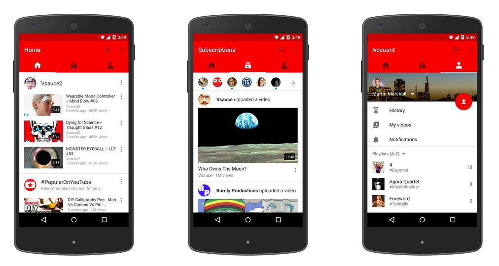
Android is shying away from the side navigation

In a recent update to the Android app, YouTube has introduced a new main navigation: tabs!
The standard side navigation is gone. Yes, it’s that hamburger icon which is common for Android apps and adheres to the Material Design guidelines by the way. To me this is a welcome change considering tabs drastically outperform a side drawer when it comes to global navigation as Luke Wroblewski points out. It’s hard to deny that the previous iteration was bloated and difficult to use efficiently, especially if you were a power user.

Although Android apps frequently make use of tabs, they would be relegated to a secondary navigation. This is in contrast to its major competitor iOS, which has claimed tabs as primary navigation since its launch.

Is this move an exception in the Android universe, carefully guided by analytics or are we witnessing signs of regret in regards to a primary side navigation which may not be as obvious on first glance?
Only time will tell. In the meantime I’ll have to get used to how weird those tabs look on the iOS version of YouTube.

Benefits of prototyping

As you may have noticed, these days it’s not enough anymore if you only provide static mockups as a designer. People have come to expect more and rightfully so. Those people being a mix of developers, clients or stakeholders you end up working with at some point or another of a project.

With the emergence of new tools created specifically for interactive prototyping, another layer of complexity has been added to a designer’s job. Last year alone, a handful of these were released trying to overtake Facebook’s Origami/Quartz Composer reign. But with this new layer also comes a great opportunity to design and communicate more efficiently.
In this post I’ll lay out the benefits of including prototypes into your workflow.

Why should you prototype?

Just because you haven’t felt the need to build prototypes in the past that doesn’t mean it can’t improve the way you design right now. As with many things in life, it’s never too late to get started. Lucky you!
Anyways, my short answer to this broad question would be something along the lines of: Because it’s not only useful but really fun!”
For the longer answer you can keep on reading.

Test early, test often

The main reason for me to jump into prototypes in the early stages of a project is to try out interactions and see if they make sense from a user perspective. Testing your app concept thoroughly in the early stages is invaluable. It allows you to discover possible shortcomings or issues you haven’t even thought of before.
As strange as it may sound, the more mistakes you make at this point, the better. Your prototype is nothing more than a disposable sketch anyway.

Iterate, iterate, iterate

Building on the previous step, identifying a problem allows you to revise your design decisions in order to find something that might be more suitable for the issue at hand. After all it’s just another canvas for you to play on. Again, your prototype is nothing more than a digital sketchbook and you should treat it that way. It’s in your best interest explore several options before going ahead with the final design. Who knows what great solution you may end up with after some tinkering?

I’ve found myself literally just playing around with different ideas on the fly, just because ideas could be discarded guilt-free and that felt pretty good. In fact, this is where I encourage you to go over the top with your designs because once the project goes into production, nobody will want you to try out an alternative way to implement that navigation drawer. Trust me.

Communicate with your team

Whenever a developer asks “What happens if you tap here?” pointing at your wireframes, you can simply pull out your prototype and walk him through the interactions of the app. This saves everyone time and your developer will be able to understand exactly what you mean. No more guessing or misunderstandings because initial instructions were too vague. No confusion = good.

Lastly, keep in mind that a prototype can and should generate spontaneous feedback from your team. Since it’s not the finished product, I’ve found that people are more inclined to critique a prototype as only little time was spent creating it in the first place.

Hopefully this made you want to get started with your own interactive prototypes. In another post I’ll write about the current tools we have at our disposal and why I prefer one over the others.