Posts tagged with: tools

Subform is probably the last Kickstarter I backed

subform

In 2016 I found out about a new digital design tool called Subform on Kickstarter. At that point I’d already been fully commited to Sketch but I was intrigued by this approach around dynamic layouts and what seemed like incredible flexibility.

I waited until pretty much the last day to actually back this project because I’d been disappointed by previous Kickstarter projects in the past. (Haven’t we all?)
For some reason though I was cautiously optimistic with this one. In the final hours the creators Ryan Lucas and Kevin Lynagh managed to surpass their initial goal of $100,000. When it was all said and done they were sitting on $112,651.

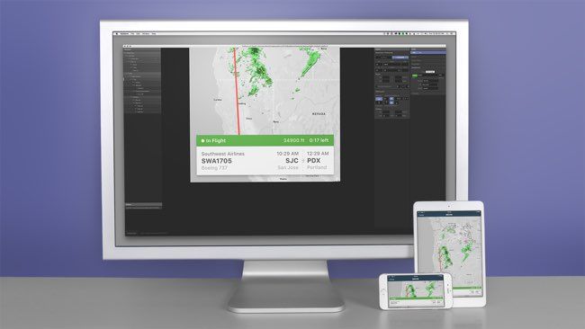
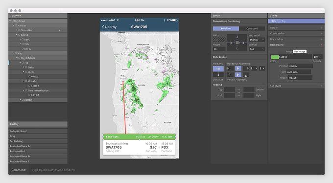
Shortly after the end of the campaign I received an email with access to the beta software as well as the forum exclusive to backers of the project. I honestly had very low expectations but still had a quick play with this first version of Subform to see what it’s about.
However I didn’t bother investing a lot of time in it until more progress was made. It seemed overly complicated compared to something like Sketch or Adobe XD which didn’t appeal to me initially so I left it at that.

subform_screenshot

Over the next few months I would get weekly updates of trending forum posts and while I didn’t particpate in the discussions at all it still gave me a sense of progress. The developers were interacting with the community and I would check the app for updates every now and then.
Things seemed to be on track and I was expecting a major release in the near future. Then something weird happened.

The weekly updates had less content. Backers seemed to have deserted the forums or lost interest. I decided to look into Subform’s status when a backer voiced his concerns about the development of the tool. A week later the creators made an announcement:

Hi friends,
We have some bad news: We will no longer be developing Subform.

[…]In testing and talking with a huge range of designers, we found that the promise of Subform was different for everyone. Many wanted a more efficient drawing tool, but only if it has full feature parity with Sketch. Some wanted complex conditional logic for prototyping, a la Axure. Others wanted a tool for visually composing React components, a WYSIWYG web editor, and so on.

Unfortunately, what we’ve found is that there isn’t a single product scope that’s achievable in the near-team—and is still useful and usable for the majority of testers. Going forward, we suspect that we’ll see more specialized tools for specialized tasks, rather than monoliths. (We released Sketch.systems37 as a standalone tool, rather than a complex integration into Subform, for this reason.)

We appreciate all of the support and feedback ya’ll have given us over the past three years, from funding our first prototype on Kickstarter to the many long conversations here on this forum that convinced us that we needed a better layout engine and friendlier UI interactions.[…]

So that was it. Boy am I glad I didn’t waste any time on this. I already learned my lesson with Macaw. Now don’t get me wrong, I’m still disappointed. Not because of the money but because they tried their best and couldn’t make it work which is always a shame.
What is a bit weird in all this though, is this thing called Sketch.systems. I think we can all agree that the name is a terrible choice. I’m not sure how to feel about it, especially since they released it before they stopped working on Subform and mentioned it in their final announcement like it was no big deal.

As a designer I think it’s an interesting concept. As a Kickstarter backer I get the impression that somewhere along the way they saw this shiny new thing which seemed more promising than Subform and decided to call it quits.

I’ve had my fair share of Kickstarter disappointments, which is probably another post by itself. But for now I’m staying away from these types of projects until they’ve made it to the commercial release phase. Design tools especially tend to vanish very quickly in this space lately. Whether it’s through acquisition or abandonment.

That might mean that in the future I’ll have to wait longer and probably pay more which is fine by me if the product is worth it.

In the meantime we’ve got Framer X to look forward to so things could be worse.

Is Adobe improving the wrong software?

Yesterday I updated to Adobe CC 2015 and couldn’t wait to try out the much anticipated new features in Photoshop. This is coming from someone who uses Illustrator almost exclusively these days by the way. Without further ado, let’s have a look at what I thought were the most interesting ones.

Design Space

Design Space looks like it’s the slimmed down version of Photoshop, that screen designers in particular have been waiting for. You can toggle between the regular view and the new mode quite easily which is neat. In order to have access to this new space, you have to switch it on in the preferences panel as this is still considered a technology preview feature”.
Since a video tells more than a thousand words, I encourage you to check out this screencast commented by Photoshop Senior Product Manager Zorana Gee:

Artboards

You’ve seen them in Illustrator and you might have seen them in Sketch. Now they’re finally available in Photoshop. What I like about their implementation is that the Artboard panel is similar to Sketch which is what I’m used to. Besides that, nothing much to see here so move along.

Stacked layer styles

Similar to Illustrator’s Graphic Styles panel, Photoshop now allows you to have as many as 10 instances of gradient overlay, colour overlay, drop shadow, inner shadow and stroke. You can add these either to a single layer or a layer group and edit them at any time. I’m surprised there is a cap, but it makes sense from a performance perspective.

Export as

This option is replacing the well-known Save for Web which is labeled legacy and should disappear fairly soon. I used plug-ins like PNG Express or Slicy for exporting PNGs in the past, but this should do just fine when it comes to automated exporting, without having to rely on third party software. Be warned that it doesn’t allow to export slices anymore if you’re into that kind of thing.

Glyph panel

Some may not even care about this addition at all, but if you appreciate typography you will love the glyph panel which allows you to browse all available glyphs in a font, view alternatives and basically have fun with OpenType features. InDesign has it, Illustrator has it and Photoshop was long overdue.

Why Photoshop though?

I’d argue that Adobe has been focusing their attention on the wrong software for the past couple of years. Killing off Fireworks a while back infuriated many web designers, many of which have since moved on to the competition. Now turning Photoshop into something it wasn’t meant to be in the first place is a huge undertaking. At least it shows that the company has been actively listening to the community, even if all the new Sketch evangelists this might come as too little too late. However I’m very surprised that product isn’t getting more attention from Adobe. Seriously.
What about Illustrator? A few improvements could really push it over the top and make us forget about Photoshop entirely. It’s arguably the best software (next to Sketch) to address mobile and responsive web design that we have right now.

Consider this:

  • Artboards have been around since 2009
  • It has Layers just like Photoshop
  • It has Graphic Styles
  • It has Symbols
  • It is vector-based

Khoi Vinh recently conducted an unofficial survey among design teams in New York City on the State of Design Tools. It turns out that while Photoshop is still widely used, Illustrator is not far behind.

Adobe Illustrator is surprisingly popular. It used to be rare, at least in my experience, to find digital designers who used Illustrator, but in one of the bigger surprise findings from our visits, we encountered a sizeable contingent of folks for whom Illustrator is their tool of choice. This seems to be a function of the popularity of responsive design, for which Illustrator’s support for multiple artboards is well suited, and Retina screens, for which Illustrator’s vector-based tools are a natural fit.

This 2015 update is certainly a step in the right direction and should keep many designers satisfied for some time. As far as I’m concerned, Illustrator will remain my go-to design software until something better comes along. There’s always next year, right?

Benefits of prototyping

As you may have noticed, these days it’s not enough anymore if you only provide static mockups as a designer. People have come to expect more and rightfully so. Those people being a mix of developers, clients or stakeholders you end up working with at some point or another of a project.

With the emergence of new tools created specifically for interactive prototyping, another layer of complexity has been added to a designer’s job. Last year alone, a handful of these were released trying to overtake Facebook’s Origami/Quartz Composer reign. But with this new layer also comes a great opportunity to design and communicate more efficiently.
In this post I’ll lay out the benefits of including prototypes into your workflow.

Why should you prototype?

Just because you haven’t felt the need to build prototypes in the past that doesn’t mean it can’t improve the way you design right now. As with many things in life, it’s never too late to get started. Lucky you!
Anyways, my short answer to this broad question would be something along the lines of: Because it’s not only useful but really fun!”
For the longer answer you can keep on reading.

Test early, test often

The main reason for me to jump into prototypes in the early stages of a project is to try out interactions and see if they make sense from a user perspective. Testing your app concept thoroughly in the early stages is invaluable. It allows you to discover possible shortcomings or issues you haven’t even thought of before.
As strange as it may sound, the more mistakes you make at this point, the better. Your prototype is nothing more than a disposable sketch anyway.

Iterate, iterate, iterate

Building on the previous step, identifying a problem allows you to revise your design decisions in order to find something that might be more suitable for the issue at hand. After all it’s just another canvas for you to play on. Again, your prototype is nothing more than a digital sketchbook and you should treat it that way. It’s in your best interest explore several options before going ahead with the final design. Who knows what great solution you may end up with after some tinkering?

I’ve found myself literally just playing around with different ideas on the fly, just because ideas could be discarded guilt-free and that felt pretty good. In fact, this is where I encourage you to go over the top with your designs because once the project goes into production, nobody will want you to try out an alternative way to implement that navigation drawer. Trust me.

Communicate with your team

Whenever a developer asks “What happens if you tap here?” pointing at your wireframes, you can simply pull out your prototype and walk him through the interactions of the app. This saves everyone time and your developer will be able to understand exactly what you mean. No more guessing or misunderstandings because initial instructions were too vague. No confusion = good.

Lastly, keep in mind that a prototype can and should generate spontaneous feedback from your team. Since it’s not the finished product, I’ve found that people are more inclined to critique a prototype as only little time was spent creating it in the first place.

Hopefully this made you want to get started with your own interactive prototypes. In another post I’ll write about the current tools we have at our disposal and why I prefer one over the others.