Thoughts on the Destiny UI

Destiny 2 finally has a release date, 8 September 2017, and I’m super excited. What better occasion to tell you a bit more about one of my favourite titles?
Destiny is one of the best games I’ve played in a while. It’s a multiplayer FPS (first person shooter) with RPG (role playing game) mechanics which came out back in 2014. I didn’t start playing until sometime last year and have missed out on a lot of content since its release but that’s fine. I’m not a one of those gamers who need to unlock all the achievements and collect every single item to enjoy the game.
In saying that I wasn’t going to wait that long to get the sequel this time around and jumped on the pre-order for Destiny 2.
Why I enjoy Destiny
It obviously reminds me of Halo which is still one of my all-time favourites on Xbox. This should come as no surprise since Bungie is behind both franchises.
I like space and that’s exactly where Destiny’s story takes place. From movies like Gravity to books like The Martian to games like Halo I really enjoy being immersed in that environment. It’s like having a preview of the future. Honestly if people like Elon Musk have serious plans to colonise Mars this might become reality sooner than we think. In Destiny you can explore entire planets by foot or on your hovering Sparrow racer. On Mars the vibe is entirely different from the Moon and discovering new areas while completing missions keeps you busy for hours on end.
The reward for your troubles and slain enemies is loot. Being a fan of the Diablo series by Blizzard and RPG’s in general, it’s the first time I saw two distinct genres overlap such a great way. I highly recommend you check it out.
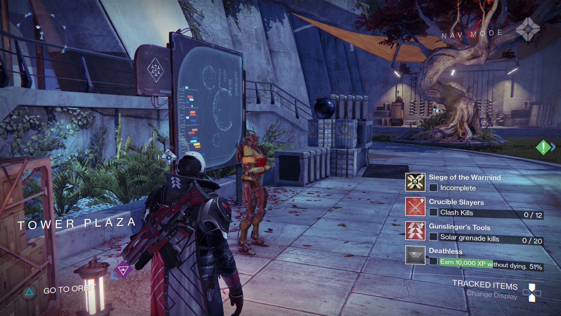
Besides the gameplay, one of the things that appeals to me the most in Destiny is the user interface. It’s really clean and quite different from other games in the genre.
Swiss style in a sci-fi interface
The designers at Bungie chose to stay away from traditional sci-fi interfaces where people expect bright colours on mostly dark backgrounds with bits of tech randomly animating.
Instead they used Swiss typefaces like Futura and Neue Haas Grotesk together with clean shapes and clear visual hierarchy. It’s refreshing to see so much care put into typography and details like loose tracking on titles feel very natural.
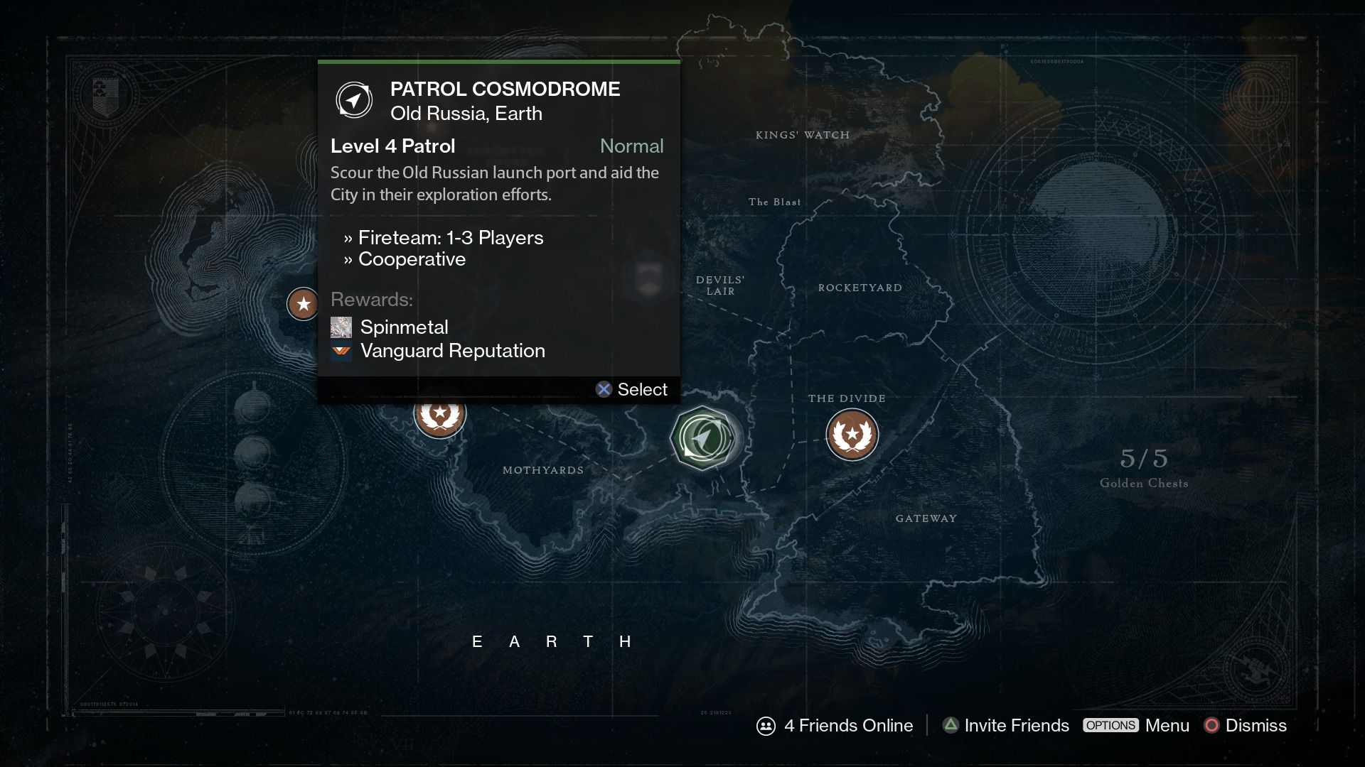
You’d think that this visual treatment would clash with traditional elements in the game such as the map which looks like old seafarers cartography. However that’s not the case as these two styles are able to co-exist without one overpowering the other. In the example below the map in the background is slightly faded out in order to allow the mission locations to draw all the attention.

Free moving cursor and hover states
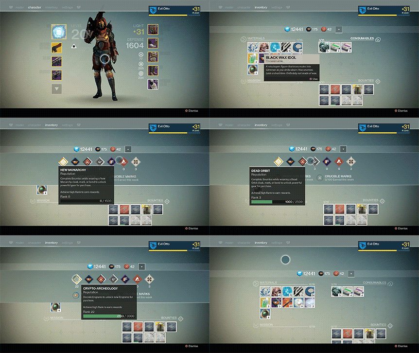
The look and feel is a lot closer to what you would find on a web site than in a game. A prime example of this is the cursor that allows players to freely move around the screen instead of tapping through options using the analog stick in a very linear way. This allows to declutter the interface since elements can be positioned anywhere on the screen.
Another example is the use of tooltips that appear when players hover over items. That way the interface remains clean even though there is a lot of content on the screen. Allowing the players to control the information they want to see makes for a great user experience and is enabled by the use of the cursor.
The result is a very quick and intuitive way to browse through content-heavy menus. Bungie has really pushed the boundaries of game UI that not only looks but also feels great. Better yet, there is even a companion app for your phone that lets you do all your inventory management on the go.
